At Sarsi, we closely watch several indicators that could potentially warn us about an imminent recession. One such indicator is the shape of the yield curve. The yield curve is a plot (Graph) between the maturity and the interest rate (or Yield) of fixed rate instruments. In normal times, higher the maturity, higher is the yield. However, when the bond market has little confidence in the future of the economy, lower maturity instruments have a higher yield as compared to higher maturity ones. In particular, the difference between the 10-year rate and the 3-month rate does a good job of forecasting a recession.
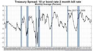
As seen in the diagram below, the spread between the 10-year rate and the 3-month rate became negative before each of the last eight recessions.
Source: Federal Reserve Bank of New York
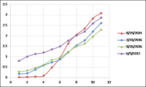
So, what is the shape of the yield curve currently? As seen below, the yield curve as of June 9, 2017 was steep. Although it has been falling, the difference between the 10-year rate and the 3-month rate was still positive at 1.2%. As per a model* developed by the Federal Reserve, at this level the probability of a recession twelve months ahead is only about 5%.
Please note the past is no indication of the future and no indicator is fool proof, and this indicator is no exception. The biggest determinant of long term performance of investors is having a plan and sticking to it. However, by constructing portfolios that are ‘macro aware’ we at Sarsi attempt to add value at the margins.
*: You can read more about this model here https://www.newyorkfed.org/research/capital_markets/ycfaq.html


